Problem & Overview
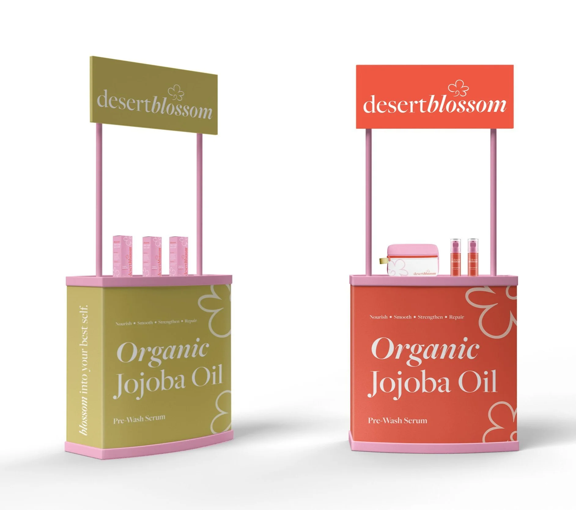
Cater a hair care line for 18-24-year-olds that prioritizes quality ingredients and has a youthful, fresh feel. Develop a memorable brand identity relevant to an intended audience with an appropriate design suite of cohesive and functional products. Demonstrate brand awareness and develop an app that improves user interaction with the brand. Project duration lasted from January-May 2024
Programs
Adobe Illustrator, Photoshop, XD, After Effects, and Procreate
Solution
Desert Blossom is an organic hair care brand targeting young women. The vibrant and youthful tone of the visual identity gives a unique perspective to organic hair care. Desert Blossom provides hair care solutions for all individuals regardless of hair type or texture. The app features a seamless shopping experience for users and allows them to explore what the brand offers.
Research
I began researching competitor hair care brands and gathering inspiration from outside sources. Many organic hair care brands on the market focus on minimalist, earth-toned themes, so I know I wanted Desert Blossom to have a youthful, eclectic identity. The jojoba plant was the focus of the product line which I took into consideration when sketching a logo. After multiple rounds of sketching and revisions, I went with a blossom sketch reminiscent of the jojoba plant buds. A serif typeface was used for the logotype to communicate sophistication and charm. The balance of luxury and playfulness gives Desert Blossom a timeless yet modern approach. For my user research, I identified a consumer within my age range, Julia. By mapping out her user journey and desires from the brand, I was able to see what features she would benefit from in an app.
Challenges
In a world of mass production, especially in the beauty industry, creating an authentic and bold brand was challenging to produce. However, through research and exploration, I was able to find a spot within the market where Desert Blossom could thrive. Finding an app layout and design that was not too overwhelming was another area of difficulty. Due to the brand being bold and vibrant, I did not want users to feel overwhelmed or distracted. By utilizing white space, I allowed my intended audience to scan through products easily and find what they were looking for.
Learnings
Throughout this project, I worked across multiple design platforms to create collateral for Desert Blossom. Not only did I need to focus on individual tasks like packaging design and app prototype, but how the brand was being communicated as a whole. The overall scope of this project was enlightening to work on because it pushed my boundaries as a designer. A critical learning point for myself during this venture was identifying a target market spot and brand positioning.


